|
Monart:
During the 1920’s a type of glass known as Monart Ware (later
Monart Glass) was produced by the company of John Moncrieff Limited of Perth in Scotland. Production began in 1924 following
the “accidental” making of a prototype by Salvador Ysart, a Spanish born glassblower employed by the firm, which
was seen by Isobel Moncrieff, wife of the proprietor. The name “Monart” was simply formed by taking the prefix
“Mon” from Moncrieff and the suffix “art” form Ysart.
The Moncrieff company primarily
made scientific glass, such as gauges, meaning that at most, at any one time, Monart wares only accounted for a maximum of
10% of the factory’s total production. Monart ranges included flower vases and bowls, decanters, glasses, sundae sets and lamps. Inspiration for the shapes
largely came form the Chinese pottery, whilst colours were influenced by fashion in interior design; hence for example, pastel
shades predominate during the post-war era. New colour ranges and shapes were introduced by the firm, who often used trade
fairs to promote the fresh wares. Typically pieces of Monart are nowadays recognised as having a colour combined with a black
rim that includes aventurine (random pieces of gold-stone), yet there are many, many, colour variations, often not including
aventurine.
Eventually the wares were successful enough
to be sold not only in some of Britain’s most important department stores (such as Liberty’s in London) but also
in North America, Canada, Australia and South Africa. After World War II John Moncrieff did not want to go back into art glass
production immediately, which frustrated Salvador. This, combined with a long running disagreement with his eldest son Paul,
was the catalyst that made him leave the firm in order to start his own company “Ysart Brothers” with his two
remaining sons, Augustine and Vincent. Paul stayed at Moncrieff’s continuing to make Monart from 1947 until 1961 when
production ceased – only a few months after Isobel died.
__________________________
Vasart:
In 1946 “Ysart Brothers Glass” was formed, loosely basing
its designs on those of Monart, using some identical shapes, whilst adapting others, as well as producing their own forms.
It is generally believed that during the early period of the company’s history the colours used were deeper and more
vibrant.
In the same way that Isobel Moncrieff orientated Monart wares toward fashion trends of the day, the Ysart
Brothers Glass company reflected the post-war desire for pastel colours, gradually producing more items with pale greens,
lilacs, pinks, blues, turquoise and yellow, often using one colour in conjunction with another, or with white. One of the commonest ranges produced by the firm was “Harlequin”, which more
usually utilised a colour with black to the upper part of the body and a scattering of randomly coloured canes around the
middle area of the vessel.
The “Vasart Glass Company”
name that superseded the Ysart Brothers title in 1956 took on the previously used product name of Vasart. This had been derived
from using Vincent, Augustine and Salvador’s initials in conjunction with the latter half of their surname. By this
point in time Vincent was the only surviving member since both his father and brother had died. The new company name had been
instigated by Vincent being joined by George Dunlop of Pirelli Glass Ltd, Potters Bar, London, whose connection with the firm
grew from the contracts that it had given Ysart Brothers to decorate glass starting in 1949.
The new firm continued to produce the same sort of wares as before, whilst also gilding and enamelling items for decoration
for firms such as Martini. Even some of the art glassware’s received additional gilding to their rims, although this
was more usual on the small vases and baskets often referred to, incorrectly, as miniatures. The
first commercial item produced in conjunction with another company, Teachers whisky, was an ashtray in the form of a collapsed
whisky bottle complete with label. Vincent spent a considerable amount of time developing this line after a request by Teachers
to see if Vasart could reproduce one that had been produced by accident in a potter’s oven in New York. Several versions
of this were produced over the years, identified chiefly by the difference in label and stopper used on the particular variation. There was also another link with a whisky company, that of Bell’s, a Perth based firm
who commissioned Vasart to make a series of coloured glass bell shaped decanters to promote their whisky. Usually the original
gilded stopper, which matches the banded gilding to the bottle, is missing.
Identification of Vasart is often thought to be simply a matter of looking for a acid etched script mark to the base of
an item, however this is a misnomer, since this kind of mark (not signature) was used for about 10 years between 1946 and
1956, being replaced with a black label having silver writing and border. Initially Ysart Brothers had used a round black
and white paper label with spaces for a code, not unlike that used by Monart. To date the versions of this label that have
been recorded in recent times have generally not had the pattern/colour code filled in. Interestingly, there was a fruit set
that included 6 bowls, 6 under-plates and a matching large bowl in the Micheal Parkington collection that was sold at Christies,
South Kensington, London, in October 1997 and April 1998. The set had labels on every piece, all of which included codes.
Sadly, not only were they split into different lots – they were also in separate sales!
The firm finally
changed its name to “Strathearn” after being bought by Teachers Whisky and moved in order to increase production
of their novelty publicity ashtrays. It was not possible to fulfil the capacity required at The Shore Works, so a new glassworks
was built in nearby Crieff that the company moved to in January 1964.
__________________________
Strathearn:
In January 1965 the newly built factory of Strathearn Glass was opened in Crieff, Scotland by the Prime Minister, Sir Alec
Douglas Home. It was the successor to the firm of Vasart Glass Ltd that had been run originally by Salvador Ysart and his
two sons, Augustine and Vincent under the name of Ysart Brothers Glass. The catalyst for this move was the need of Teachers
Whisky to have an increased production of their novelty collapsed whisky bottle ashtray. The Vasart Glass works was deemed
too small to be capable of achieving the increase in production required, so Teachers Whisky took over Vasart Glass Ltd during
1964 and built the Crieff factory ready for the move and the change of company name the following year.
Vincent was the only family member left to
continue the Ysart link. He was Works Manager co-ordinating production whilst making glass and paperweights for a few months
prior to leaving since he only stayed until sometime later that year. Therefore it could be argued that the factory continued
a tradition that was started by the Ysarts rather than the production being strictly under the banner of ‘Ysart’
glass. Vincent is recorded as having taken a job with an Assurance company in Perth in 1966, finally breaking the Ysart link
with this particular strand of glass making. (However, his brother Paul, who had stayed at John Moncrieff to make Monart until
1961, was at this time working at Caithness Glass as Training Officer and Technical Advisor prior to starting his own studio
in Harland, Wick where he specialised in paperweight making – an area in which he is now world renowned.)
Stuart
Drysdale had taken over the running of Vasart in 1960 acting as manager and continued this role at Strathearn Glass until
February 1968 when he left to form Perthshire Paperweights. George Dunlop of Pirelli Glass was appointed as a director of
Strathearn, having had that position within Vasart Glass Ltd since he had assisted Vincent in setting up that company. He
was a director of Teacher & Sons whisky concurrently.
Despite the lack of an Ysart within the factory the work produced
largely continued in the same vain as the production of Vasart using a similar colour palette to produce a Harlequin Range
whilst harking back to Monart Glass making a range of wares that used a colour, black and aventurine, both opaque and transparent
versions, sometimes including random swirls. The range of colours included blue, green and vermilion red. Both these ranges can be readily identifiable by the ‘Leaping Salmon’
impressed seal mark so often used to cover the pontil by the company. A few ranges only used a paper label, which is often
missing nowadays since it was only gummed and washing simply soaked the label off.
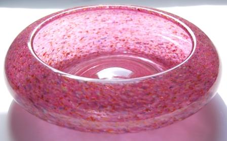
There was also a range of multi-speckle decorated vases
and bowls using a base colour with multi-coloured enamel specks that had been marvered into the surface of the colour and
then cased. Some of these pieces bore a resemblance to granite, especially where a sympathetic base colour was used. Hence
some collectors refer to this range as the ‘Granite Wares’. A similar technique was employed for a surface decorated
range of ‘Cloisonné’ pieces, which used a base colour (lime green, pink or vermilion red) that had a cracked
effect with other colours speckled over its surface. There was no casing to this range, nor did it have the seal type pontil
usually employed to identify most Strathearn since neither the thickness of the glass nor the colouring technique allowed
its use.
In addition to the vases, bowls and posy bowls Strathearn continued to make the Tulip Lamp in both the Harlequin and Monart
style ranges that first started life at Vasart. In addition there was a cylindrically formed vase style lamp that had a squat
bun-shaped integral base and, like the tulip lamp was lit internally from the base.
Exceptions to this tradition can be seen through the influence of Angus Sillars, the Design Director who stayed
at the factory from its inception in 1964 through to 1980 when it changed ownership and name. His designs included pieces with a Scandinavian influence such as the tall, solid glass lamp base(s) with a wide
base and having a twist to the surface with internal decoration of random twists of a colour, most usually blue, green or
blood red and sometimes combined with white – there is also a clear version. Other designs include another lamp base
of simple cylindrical form tapering to form a ‘peak’ able to take the bulb holder and a third being a candleholder
in the form of a solid cylinder of clear glass with a cylindrical hole in the top to take a candle, the body being decorated
with a random swirl of tiny bubbles clustering from the base. Sillars was also responsible for a number of paperweight designs.
Other glass workers included Jack Allen, John Deacons both
of whom also made paperweights and Chic Young. Jack Allen was a designer whilst John Deacons was an apprentice at this point
in his career; although he went on to form his own studio producing mainly paperweights and some glass in the Ysart tradition.
Production
of art glass continued until 1973, when the firm began to produce engraved glass under the auspices of Alasdair Gordon. Demand
for the coloured glass that Strathearn produced had declined necessitating a new line of production. In 1980 Strathearn Glass
Ltd was taken over by Stuart & Sons Ltd, becoming known as Stuart Strathearn. This firm carried on producing engraved
wares and Strathearn designs, whether glass vessels or paperweights ceased. Instead clear glass blanks were made to be cut
at the Stourbridge headquarters of Stuart & Sons Ltd.
© Pictures
and text - Nigel Benson - 20th Century Glass, 2005
___________________________
Clutha Glass
Possibly the earliest example of free blown art glass produced
by a company in Britain, Clutha Glass, made by James Couper & Sons, was first introduced in 1888. Nowadays it
is celebrated for the designers that are associated with it, in particular the name of Dr Christopher Dresser, but less
well known are the pieces by the architect/designer, George Walton.
Dresser's
work is very much in the freeform tradition that we now think of as the Studio Movement began nearly 100 years after
Dresser's designs first saw production, which explains in one easy sentance why Dresser is so renowned today. He had an
inate ability to be far in advance of his contemporaries, foreseeing much that has since come to reality, not only
within British 20th century design, but also across Europe, most notably in Germany with the Wiener Werstatte and the Bauhaus,
and in Austria, the Successionests - all of whom recognised his influence.
His designs for
James Couper had a fluid look that allowed the glass to express its molten state in 'solid' form. This quality
was excentuated by, more often than not, muted colours with swirled effects, most usually pale greens swirled with white and
aventurine, but transparent ambers and reds were also used by Dresser. Shapes included the classic rose sprinkler, as
well as less formal assymetric shapes, although he did produce some simple symmetrical forms as well.
Dresser's Clutha designs are usually,
but not always, marked with a large acid etched logo on the base, often taking up the whole of the base of a vessel. The logo
is a lotus flower and along with the name of 'Clutha' there is also that of Dresser. This logo was one of only two
that were allowed to be used on pieces retailed by the famous London department store, Liberty's - a rare
accolade indeed!
According to Christopher Morley in the catalogue for the exhibition "Christopher Dresser,
People's Designer 1834-1904", it is possible that the work for Couper was preceeded by very similar designs
for the North Eastern company of Sowerby in 1882, known as Studio Glass. This conjecture is supprted by research combined
with the fact that Dresser had lectured on the decoration of glass as early as 1871. It would therefore be surprising
that he waited until the introduction of Clutha, 17 years later, in order to begin to augment his theories. Given Dresser's
abilty to design in every sphere of the applied arts this delay is indeed somewhat strange and lends some credance to the
suposition the he designed for Sowerby. The Studio Glass by them was generally symetrical in form they were much smaller in scale, but the known pieces are usually swirled with opaque greens
and white - unlike the later, generally transparent, Clutha glass.
Unlike
Dresser, George Walton produced designs in Clutha glass that were largely pure, simple symmetrical forms with subtle
pale green glass having multi-random bubbled decoration and whisping swirls. There are far fewer designs by Walton, but nonetheless
they are highly prized by collectors of glass, decorative arts, and Arts & Crafts.
 |
 |
 |
|
Examples of Scottish glass, including Monart, Vasart and Strathearn, now broadly referred to as 'Ysart' glass
|
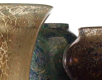
| Detail of three early Monart Ware vases, in 'Cliosonne', 'Paisley Shawl' and surface 'Banded Swirl' |
|
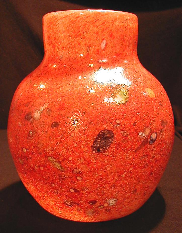
| Early Monart Ware vase in red stoneware with random milleflori inclusions, shape A, colour 4, c1924 |
|
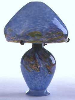
| Monart Glass blue and polychrome 1930's 'Mushroom' lamp |
|
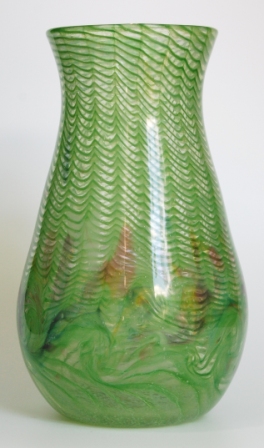
| Monart lime green lattice vase with polychrome whorls, shape JJ, 1930's |
|
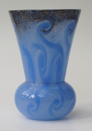
| Monart, blue swirled 'thistle' form vase, shape MI, probably post war |
|
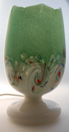
| Vasart green 'Harlequin' pattern Tulip vase, 1946-63 |
|
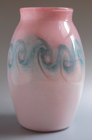
| Typical Vasart two-tone vase with 'Ysart swirls' between, 1946-63 |
|
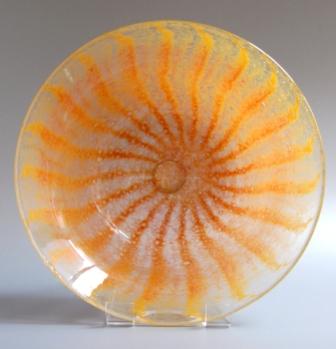
| Two-tone striped Vasart bowl (with pontil button showing through base) 1946-63 |
|
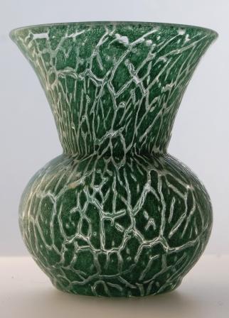
| Vasart dark green 'Cliosonne' thistle vase, sometimes inaccurately called 'miniature' |
|
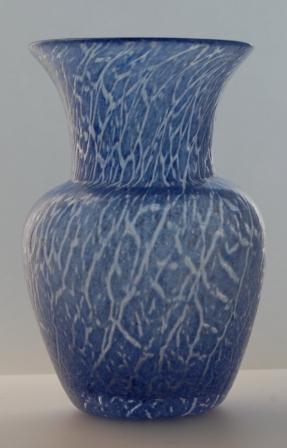
| Unrecorded Vasart shape - V037 - in rare Cliosonne technique |
|
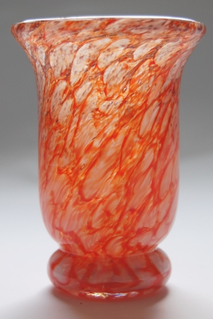
| Vasart vase in a scarce colour way. This size of vase often incorrectly referred to as 'miniature' |
|
| Strathearn bowl from the 'Granite' range, clear cased, multi-coloured speckles in pink, late 1960's |
We are well known for stocking Monart and Vasart glass and always hold stock by both companies. If you wish to purchase
'Ysart' items, whether a beginner, or you have and existing collection you want to augment, please
|
 |
 |